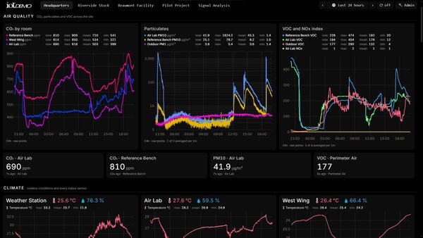
The Dashboard Nobody Opens
An Expensive Screen Nobody Looks At
The pattern is familiar enough to be a genre. A deployment goes in, the data arrives, and somebody builds a dashboard showing everything the system can measure. It is technically impressive, it took a fortnight, and within a month nobody opens it except during demonstrations.
The failure is editorial rather than technical. Fifty panels covering every available metric is not a dashboard, it is an inventory of the database, and finding anything relevant on it means scanning past forty-three things that are not. More data on a screen does not produce more insight, it produces less, because attention is the scarce resource and every panel spends some.
The dashboards people actually check have six or eight panels, and each one exists because somebody has a question at nine in the morning that it answers. That constraint is uncomfortable to apply, because it means deciding what not to show, and the panels you delete are all individually defensible.
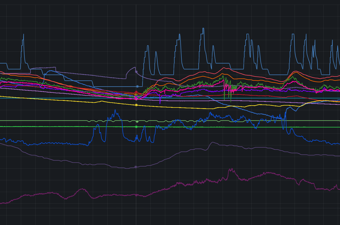
Build for the decision, not for the data. If nobody can name the action a panel changes, the panel is decoration, and decoration costs attention that the panels next to it needed.
Start From Who Opens It
Most of the value comes from realising that different people need different screens, and that trying to serve all of them at once is what produces the fifty-panel wall.
The person running the operation wants exceptions and nothing else: what is out of range, what has gone quiet, what needs a visit today. Their screen is mostly empty when things are fine, which feels wrong to build and is exactly right. A screen that always looks busy trains people to ignore it.
The person accountable for cost wants comparison and trend: this month against last, this site against its peers, before and after the change that was supposed to save money. Their screen has few panels and long time ranges, and it is the one that justifies the deployment at budget time.
The person diagnosing something wants raw resolution and the ability to go anywhere. Their screen is not really a dashboard, it is an exploration tool, and it can be dense because they arrive with a specific question.
Three modest dashboards serve those three better than one comprehensive one serves any of them. The comprehensive one exists to make a project look finished, which is not a use case.
What Each Panel Type Is For
Panels earn their place by the question they answer, and the mismatch between panel type and question is the second most common problem after quantity.
A time series is for change: consumption over a fortnight, temperature across a season, a load profile through the working day. It is the default and it is over-used for values where the history is irrelevant.
A single number is for status. Current battery level, last reading, today's total. Putting these on a line chart forces the reader to interpret a graph in order to extract one figure they could have read directly.
A gauge is for a value against a range, where the range is the interesting part. Tank level as a proportion of capacity, or moisture against field capacity, reads better as a dial than as a number, because the question is not what the value is but how close to a limit it sits.
A table is for making an exception actionable. Devices that have not reported, with the last time they did and where they are, is a work list somebody can take to a van. A graph of the same data is interesting and cannot be acted on.
A map is for anything where the geography is the pattern. Sites coloured by status turns coverage and clustering into something visible in a second, and it is the panel most often missing from multi-site deployments.
Alerts Are the Product
For most deployments the alert rules matter more than the dashboard does, because nobody watches a screen continuously and the whole point is to be told rather than to look.
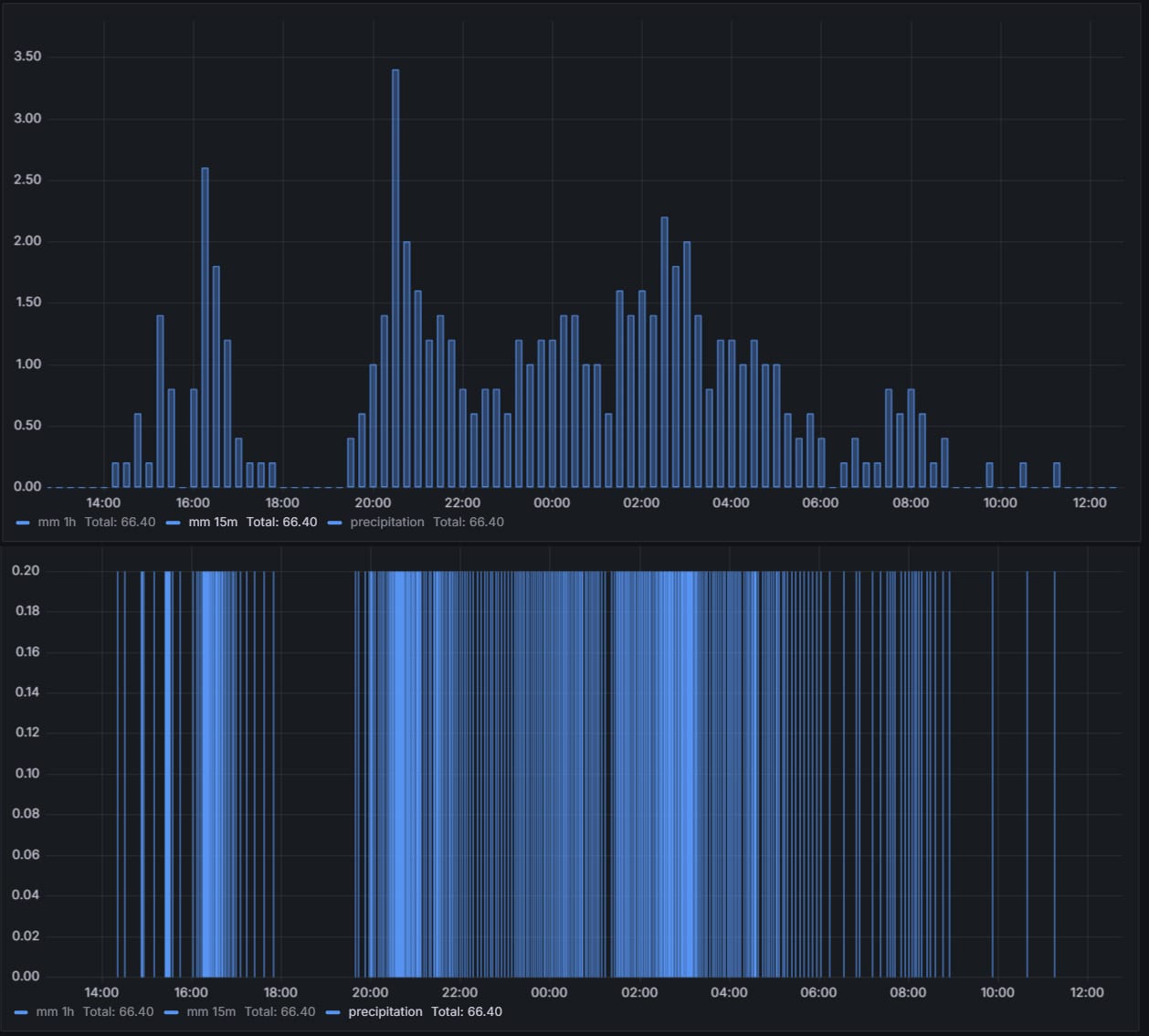
Threshold alerts need a duration or they will fire on noise. A temperature that exceeds a limit for ten minutes is an event; a single reading that exceeds it is often a sensor glitch, a transient, or a delivery van with its doors open. Requiring persistence removes almost all false positives at the cost of ten minutes of latency, and ten minutes is rarely the difference between a save and a loss.
Silence alerts are the ones people forget and the ones that matter most, because a dead sensor reports nothing and nothing looks like normal. The rule is that a device which has not reported in roughly twice its expected interval is a problem, which tolerates the ordinary variance in transmission timing while catching an actual failure. Without this rule a fleet degrades invisibly and the dashboards keep drawing yesterday's last value.
Infrastructure alerts fire immediately rather than after a delay, because one gateway down takes every device behind it with it, and the reason a hundred sensors went quiet at once is worth knowing in the first minute.
Then there is the routing, which is where good alerting goes to die. An alert that arrives in a mailbox nobody reads is not an alert. Deliver to the channel the team actually uses, whether that is a chat system, a paging tool or a ticket queue, and make sure each alert names the site, the device and what to do, because the person receiving it at seven on a Sunday morning has no context.
Finally, and this is the part that requires discipline: an alert that fires often and is always ignored is worse than no alert, because it teaches people to dismiss the whole channel. Either tighten it until it means something or delete it.
Making a Year of History Draw Instantly
The complaint is always the same: the dashboard takes thirty seconds to load. The cause is nearly always the same too, which is a panel asking for six months of raw readings and the database scanning millions of rows to draw four hundred pixels.
The fix is to stop asking for raw data at long ranges. Pre-aggregate into tiers, so that a query for the last day reads raw readings, a query for the last month reads hourly buckets, and a query for five years reads daily ones. Modern time-series storage maintains those tiers incrementally rather than by scheduled job, which is one of the better arguments for the storage described in the data layer article.
Two query habits do the rest. Always constrain by time, because time-series storage is organised around time and a query without a range defeats the entire design. And filter on the indexed dimensions, device and site, rather than on a decoded value, because the first is a lookup and the second is a scan.
Default the time range to something short. Most operational decisions are about the last day, and a dashboard that opens on the last twenty-four hours and lets people widen it deliberately is faster for everyone than one that loads a quarter by default because somebody might want it.
One Dashboard, Every Site
Duplicating a dashboard per site is the maintenance trap that catches every multi-site deployment. Six copies drift, a fix lands in four of them, and after a year nobody knows which is authoritative.
Template variables solve it properly: a dropdown selects the site, floor or device, and every panel re-queries against the selection. One definition serves the whole estate, a change lands everywhere at once, and a new site is a row in the registry rather than a copy-paste job.
This is another place where the relational half of the data pays for itself, because the dropdown should be populated from the site hierarchy rather than from a hand-maintained list. A site added to the registry appears in the selector without anyone editing a dashboard.
When Grafana Is Not the Answer
Grafana is the sensible default and I use it for most work, but it has a shape and not every requirement fits it.
It is built for people who are comfortable with charts and time ranges. Where the audience is a tenant checking their consumption, or a farm manager on a phone in a field, a purpose-built page with three numbers and one chart converts far better than a general-purpose analytics tool, and the difference in adoption is not marginal.
It is also awkward when the interaction is not exploration. Acknowledging an alert, entering a meter reading by hand, annotating a spike with what caused it, or approving something are all application behaviour rather than dashboard behaviour, and bolting them onto a visualisation tool produces something worse than either.
And where the output is a document, a monthly service charge statement or a compliance report, that is a report generator rather than a dashboard, however similar the underlying query is.
There is a live dashboard on this site running against real devices, which is a custom build rather than Grafana, deliberately light and fast on a long time range. It is a fair illustration of where that route ends up when the audience is not analysts.
What I Provide
The work starts with a conversation about decisions rather than metrics, because the panel list falls out of that and does not fall out of the database schema. Then the build: the queries and the aggregate tiers behind them so that a year draws without a spinner, the alert rules with their durations and their routing, the template variables so one definition serves every site, and the integration into whatever your team already watches.
Everything stays portable. The dashboard definitions, the query documentation and the alert configuration are yours, on a self-hosted installation with no licence fee, and your team gets trained to change them without me. If your audience is better served by a purpose-built page than by a general-purpose tool, I build that instead and say so before starting rather than after.
Does this describe your project?
If any of the above sounds like something you are dealing with, tell me about it. You will get a straight read on the right approach for your situation, and the first conversation costs nothing.
Start a conversationPrefer to see the finished thing first? There is one running on real devices